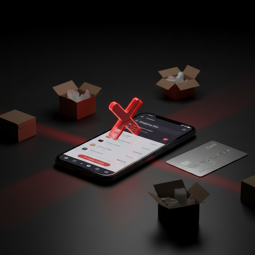
Your ads are working. People are clicking. Products are being added to carts.
Then nothing.
They leave. No purchase. No email. No trace. Just another abandoned cart in your analytics.
If this sounds familiar, you probably don’t have a traffic problem or a product problem. You have a checkout problem. And in most cases, the fixes aren’t complicated — they’re just invisible to everyone except the people trying to buy from you.
Here are seven checkout UX mistakes we see constantly, especially in the MENA e-commerce market. Each one is quietly costing store owners thousands every month.
1. Forcing Account Creation Before Purchase
This is still the single biggest conversion killer in e-commerce checkout. A shopper has decided to buy. They’ve compared options, chosen a product, added it to cart. They’re ready.
Then you hit them with: “Create an account to continue.”
That’s friction at the worst possible moment. Studies consistently show that forced registration causes 25-35% of cart abandonments. The shopper doesn’t want a relationship with your store — they want the product.
The fix:
Guest checkout. Always. You can ask them to create an account after the purchase is complete. At that point, all you need is a password — you already have their name, email, and address. The conversion from guest to account holder is surprisingly high when there’s zero pressure.
2. Too Many Steps, Too Many Fields
Every extra field in your checkout is a small tax on the shopper’s patience. And patience runs thin on mobile — which is where most of your Saudi and Gulf customers are shopping.
We’ve audited checkouts that ask for:
- Company name (for a B2C purchase)
- Fax number (in 2026)
- Separate billing and shipping addresses (when 90% of orders go to the same place)
- “How did you hear about us?” (not the time)
Each unnecessary field adds 1-3 seconds of friction. Stack enough of them and the shopper decides it’s easier to close the tab.
The fix:
Strip it down to what you actually need to fulfill the order. For most physical products: name, phone, address, payment. That’s it. If you need additional data, collect it after the sale through a follow-up email.
One-page checkouts consistently outperform multi-step ones. If you must use steps, show a progress bar so shoppers know how close they are to done.
3. Hiding the Total Until the Last Second
Nothing kills trust faster than surprise costs. A shopper expects to pay SAR 200. They proceed to checkout. Suddenly it’s SAR 247 — shipping, tax, a “handling fee” they’ve never heard of.
This is the number one reason for cart abandonment globally, and it’s especially damaging in price-sensitive markets.
The fix:
Show the complete total — including shipping and any fees — as early as possible. Ideally on the cart page before they even start checkout. If shipping costs vary by location, show an estimate and let them enter their city first.
Some stores offer free shipping above a threshold (e.g., “Free shipping on orders over SAR 200”). This works extremely well because it reframes shipping cost as a reason to buy more, not a reason to leave.
4. Not Supporting the Payment Methods Your Customers Use
This one is critical for the MENA market and it’s where many international checkout solutions fail.
If you’re selling in Saudi Arabia and your checkout only shows Visa and Mastercard, you’re ignoring how a massive portion of your market actually pays. Mada debit cards are everywhere. Apple Pay adoption is among the highest globally. Some segments — particularly older shoppers or certain product categories — still prefer cash on delivery.
We’ve seen stores add Mada and Apple Pay and watch conversions jump 15-20% overnight. That’s not a UX redesign — it’s just removing an obstacle that shouldn’t have been there.
The fix:
Support Mada, Apple Pay, Visa/Mastercard, and consider cash on delivery depending on your market. Use a local payment gateway (HyperPay, Moyasar, Tap) that handles Saudi-specific payment methods natively.
Show payment logos clearly on the checkout page. When a shopper sees the logo of their preferred payment method, it signals “this will be easy.”
5. Breaking Mobile Checkout
More than 75% of e-commerce traffic in Saudi Arabia comes from mobile. Yet most checkout experiences are still designed on a desktop screen and then awkwardly squeezed onto a phone.
Common mobile checkout disasters:
- Tiny form fields that require zooming to tap
- Keyboards that don’t match the input (showing a text keyboard for phone numbers)
- Buttons placed where thumbs can’t reach them
- Payment forms that open in a new tab and lose the session
- Dropdowns with 200+ options (country selectors without search)
Any of these on their own might not kill the sale. But stack three or four together and the shopper gives up.
The fix:
Design checkout mobile-first, not mobile-also. Use large touch targets (at least 44px). Set correct input types so the right keyboard appears (numeric for phone, email keyboard for email). Keep the primary action button fixed at the bottom of the screen where thumbs naturally rest.
Test the entire checkout flow on an actual phone. Not a browser resize — a real phone with real fingers. You’ll find problems in thirty seconds that no desktop review will catch.
6. Weak Error Handling
A shopper fills out the entire checkout form. Taps “Pay.” Gets a red error message at the top of the page: “Please fix the errors below.”
What errors? Where? They scroll up, scan every field, find nothing obvious. Try again. Same message. Give up.
Bad error handling is silent, confusing, and more common than you’d think. It punishes the shopper for making a mistake without helping them fix it.
The fix:
Three rules for checkout errors:
Show errors inline, next to the field.
Don’t make people search for the problem.
Validate in real-time.
Don’t wait for form submission. Check the email format as they type. Verify the phone number length immediately.
Use human language.
“Please enter a valid email address” is better than “Error: invalid input in field #3.” Even better: “This doesn’t look like an email — did you mean name@example.com?”
7. No Trust Signals at the Moment of Payment
The moment someone enters their card number is the moment of maximum anxiety. Especially for first-time buyers on a store they’ve never purchased from.
Right at that moment, the page should be doing everything possible to say: “This is safe. You’re making a good decision.”
Yet many checkouts strip away all reassurance at the payment step. No logos, no guarantees, no contact information. Just a blank form asking for 16 digits and a CVV.
The fix:
Place trust signals directly on the payment section:
- SSL/security badges (shoppers recognize the padlock)
- Accepted payment method logos (Mada, Apple Pay, Visa — logos they trust)
- “Your data is encrypted” in plain language
- Return/refund policy summary (even one line: “30-day hassle-free returns”)
- Customer service phone number or WhatsApp (especially important in the Gulf — knowing there’s a human to call if something goes wrong reduces anxiety significantly)
These aren’t design decorations. They directly impact whether the shopper completes the purchase or decides it’s not worth the risk.
The Math That Should Worry You
Let’s say your store gets 10,000 visitors a month. Your add-to-cart rate is 8% (800 people). Your checkout completion rate is 40%.
That’s 320 purchases. The other 480 people wanted to buy but something stopped them.
If fixing these checkout issues moves your completion rate from 40% to 55% — a realistic improvement — that’s 440 purchases instead of 320. A 37.5% increase in revenue without spending a single extra riyal on ads.
That’s why checkout UX isn’t a design project. It’s a revenue project.
What to Do Next
Open your analytics right now. Look at your checkout funnel. Where is the biggest drop-off?
- If it’s at account creation → implement guest checkout
- If it’s at the payment step → add missing payment methods and trust signals
- If it’s on mobile → do the thumb test on a real phone
- If you can’t tell where the drop is → you need better tracking before you redesign anything
Start with the biggest leak. Fix it. Measure the impact. Then move to the next one.
Not sure where you're losing users?
If your digital product is losing users and you can’t figure out why, we’ll send you a free 10-minute video audit showing exactly what’s hurting your conversions — and how to fix it.
Get Your Free UX Audit →